Structural Coordination

Struct-model3Dview01

BIM (Building Information Model) software has had its fits and starts over the last decade within the architectural profession. Finally, it’s becoming the norm, and even consultants are picking it up. Above is the first 3D structural model that we will link into our architectural model -- and we will discover if any framing or structural members aren’t in the right place!

It’s so fun to check out your drawings in the 3rd dimension vs. the abstraction of plans and elevations....

This model is being developed in Revit Structure, and it links up very nicely into our Revit Architecture model (as it should considering they are within the same software suite).

Tough Decisions

Money symbol

We’ve been reviewing our bids for the last few weeks -- a challenging and frustrating process. Materials and building costs do not seem to reflect any economic downturn.

The price points of a number of items that we researched and would purchase directly are also towards the upper end of what we can afford, so some trimming will be done there too.

Ultimately the biggest item on the chopping block seems to be radiant floors. It’s amazing that these systems are so expensive. It’s been around for a while now, but unfortunately, it has not become a commodity item like conventional forced-air systems.

With energy conservation in mind, we are looking at a high efficiency furnace, a swamp cooler rather than a conventional compressor (central air) type air conditioner, and an on-demand type water heater.

We shall see...

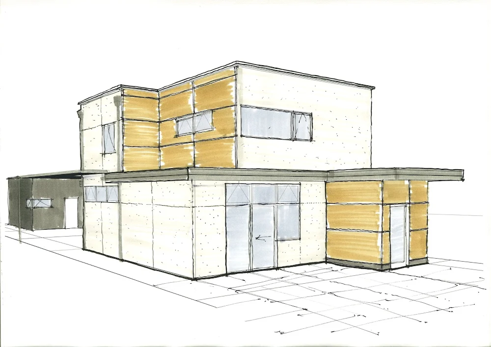
Schematic drawings are done!

Front-sketch

The months of hard work have come to an end as we have completed the schematic pricing set up drawings. Yahoo!  It feels great to finally reach this milestone and be able to move on to the next phase of the project.

Over the last week we have been meeting with contractors and printing set after set for review.  Now we wait for the bids to come in...

Zoning Limitations

Zoning-limitations

Zoning-limitations

The City of Denver has some fairly complicated and restrictive zoning requirements, limiting lot coverage as well as designating the area where you can locate the house and garage. The open space requirement and location of the structure(s) on the lot creates obvious constraints for this small narrow lot (37’ x 132’).

Initially, our goal was to build a 2400-2500 sf home, but once we designed the house we were at 2800 sf. We knew we were exceeding the open space requirements (62.5% of the lot is required to be open) with the initial first floor layout. After going over the zoning requirements once again, we realized that we needed to make serious adjustments, both in terms of square footage reductions, as well as adjusting the placement of the house on the lot.

Reducing square footage at this point was a significant challenge for us. The City offers a lot coverage incentive if you detach the garage. In other words, we can have more house with a detached garage, so we detached it. Sacrificing the benefits of an attached garage was difficult -- but once we accepted that and made some further square footage cuts (specifically eliminating the guest room/kids playroom, we are now at 2500 SF! Depending on the pricing, we may rough in for a future guest suite in the basement. In any event, we will have more outdoor space for play and sun.

Exterior Finishes

Through a quick series of sketch overlays, we've been exploring exterior finishes.

Demolition Day

With some sadness we demolished the old crumbling house.  Now we own a small  patch of dirt.  It finally seems like we are making progress with the project, and look forward to the next phase.

Interior Lighting Studies

We are now beginning to look at interior lighting schemes.  The challenge is to move beyond a sea of recessed “can” or track lights and arrive at something a bit more interesting at a reasonable price. In the quest to control energy consumption, the wisest choice would be compact fluorescent fixtures.  However, we are still having a hard time getting over their start-up behavior, light color, color rendering, and a “lack of brightness”.

There are trade-offs to think of with can light sizes too:  six inch and up are readily available and cheap.  Most smaller sizes, which are nicer and more subtle are more expensive, have limited wattage, and require more fixtures. Although low voltage would be a choice to get smaller fixtures with bright lights, we want to avoid both the cost as well as the sparkle and glare that they give off.

For more images, check out our renderings on Flickr

Current Renderings

We’ve been refining and fleshing out the plans for a month now.  There are still ideas we want to explore, but they will have to wait until after the pricing set goes out.  We need a reality check on how this project is shaping up financially.

Current Challenges:

  1. Closing off the basement at the stair in a creative and subtle way Still struggling with the entry/foyer area--we need storage and some privacy from the street
  2. Window placement and size at the kitchen--it’s going to be directly across from the neighbor, but Nancy wants some visual access to the outside from the counter 

For more images, check out our renderings on Flickr